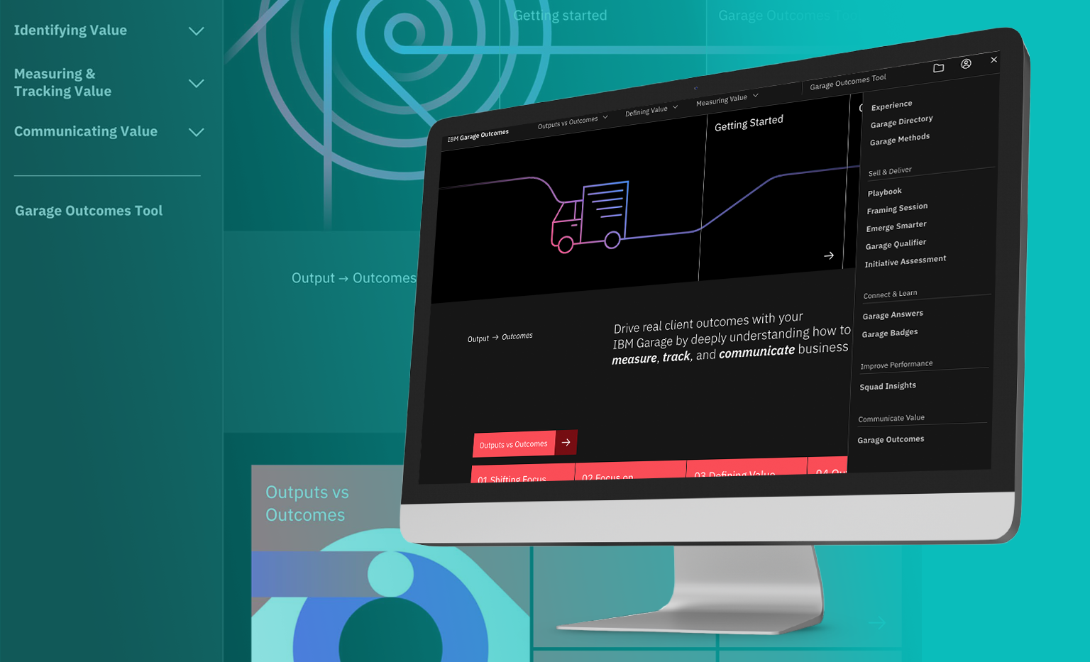
Problem
The mission was to solve the issue of IBM Consulting not being “Garage-ready”, and lacking consistency and standardization across all of IBM Consulting.
In 2019, when IBM Consulting leadership set the ambitious goal of delivering 80% of client engagements through IBM Garage within three years, the challenge from a design, project management, and UI/UX perspective was substantial. The ecosystem wasn’t fully prepared: there were few Garages, methods were unstructured, and opinions varied on how a Garage should operate within IBM Consulting. Standardizing processes, creating clear guidelines, and providing the right tools were critical to align stakeholders and deliver a top-notch user experience—both externally for clients and internally for teams seeking to access these tools.
Our original charter:
Solution
As the design lead and project manager, my mission was threefold: to execute a cohesive strategy that aligned the various Garage efforts based on user groups, manage project parameters while reporting on key outputs and outcomes to meet deadlines, and ensure close collaboration with design researchers, who served as the link to Garage subject matter experts.
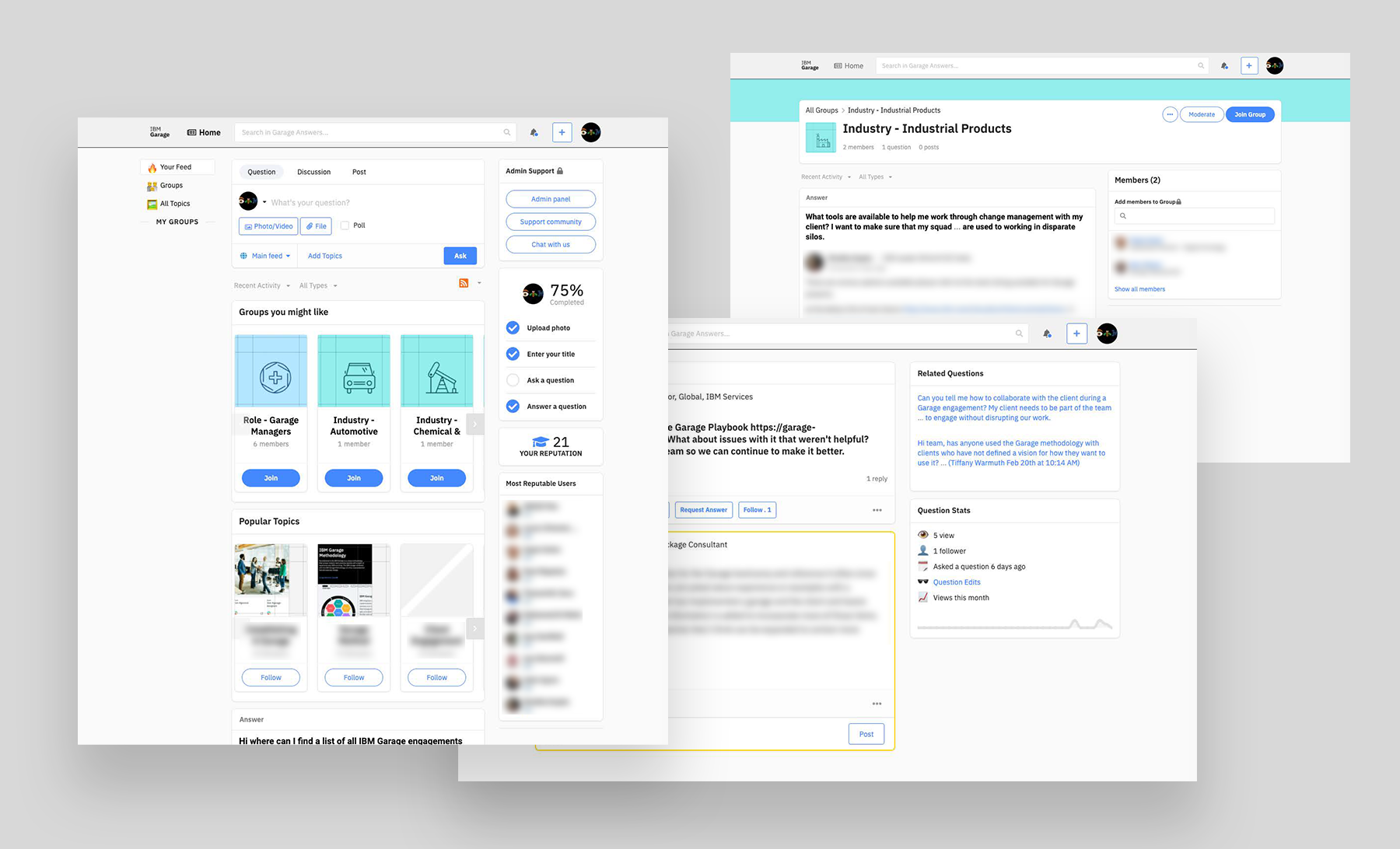
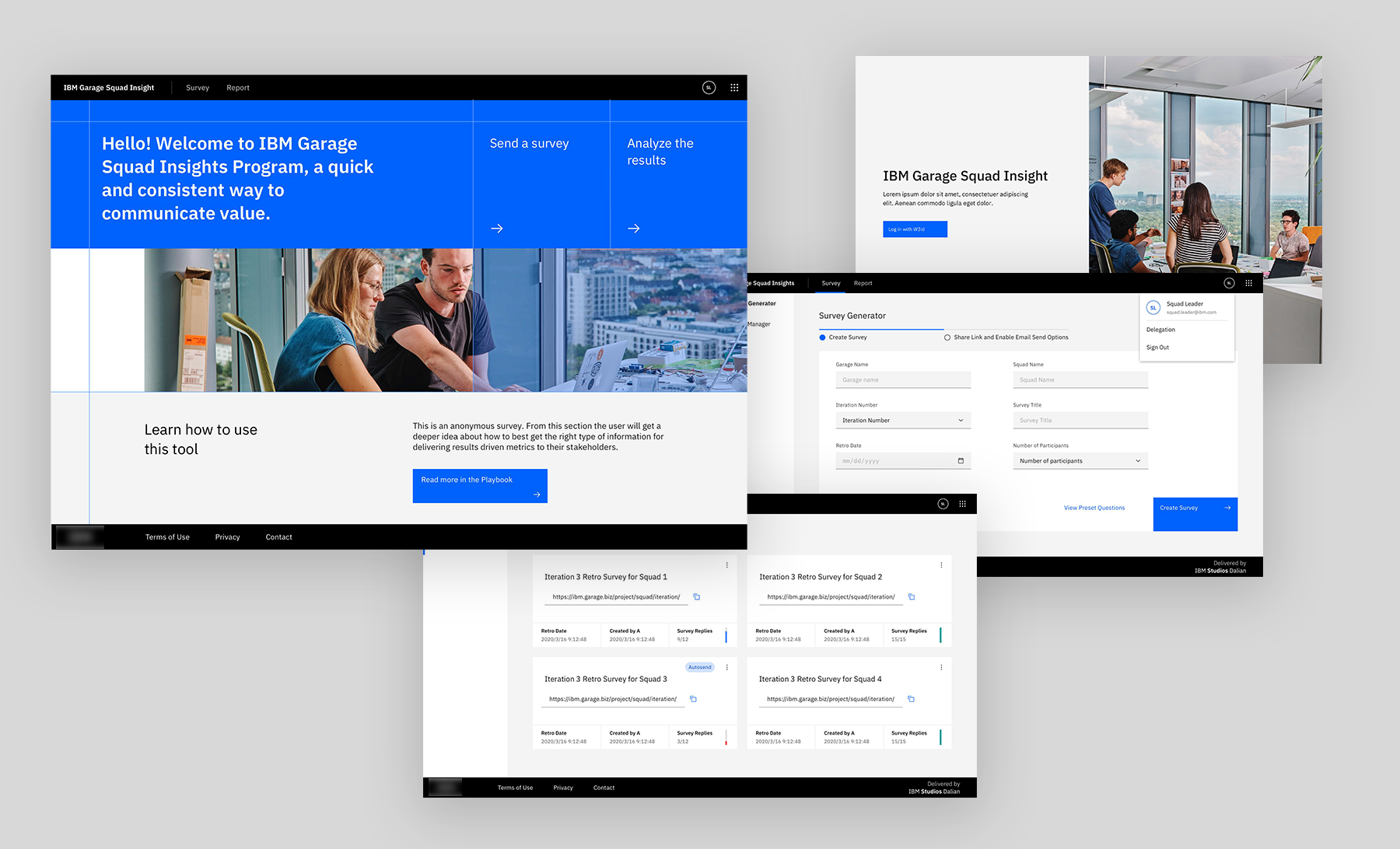
We developed multiple experiences designed to scale across the organization. The designs needed to focus on clarity, simplicity, and user-centered UI/UX principles, making IBM Garage a repeatable and scalable framework for a wide range of stakeholders. And above all be deployed at start-up speed.
You are not your user… identifying our personas
With various types of users interacting with the IBM Garage model, we knew a one-size-fits-all approach wouldn’t work. To address this, we developed five key personas, each with unique needs, and used these personas to guide our design and decision-making: Sellers, Newcomers, Go-getters, Pinch Hitters, and Pack Leaders.

Sellers need clear guidance on determining whether IBM Garage is the right fit for their clients and effective coaching on how to present and sell the concept.
Newcomers need a simple, easy-to-understand overview of IBM Garage that they can quickly internalize, adopt, and explain to others.
Go-getters need opportunities to connect with other Garages to learn from their successes and failures.
Pinch Hitters need a streamlined process for quickly onboarding new team members to ensure they can maintain the Garage’s momentum.
Pack Leaders need a simple, high-level framework that is accepted by IBM leadership to establish clear governance and direction for Garage initiatives.
Focus-driven decisive outcomes.
There were hundreds of viable ideas and dozens of workable solutions that could fall within our timeframe and budget, but we could only execute a handful that would have the most impact on our users within the 9-month deadline. We used “sharp sticks,” which are proactive, low-fidelity concepts designed to quickly iterate and communicate the value proposition and general idea using starter content and low-fidelity wireframes. The goal was to uncover the Garage community’s “gut reactions” to specific tool directions. These in-person research sessions helped us gauge the level of interest in different solutions, allowing us to prioritize and quickly eliminate lower-ranked ideas based on field-validated feedback.
During a global Garage pracitioner bootcamp, attendees were presented with these cards and asked to rank them in order of importance to their jobs. They also filled out a survey to assess their needs further and validate the assumptions we made in our initial design thinking workshops.

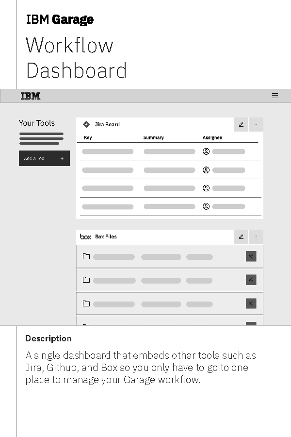
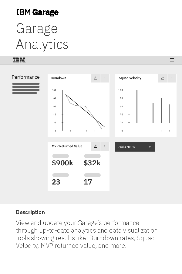
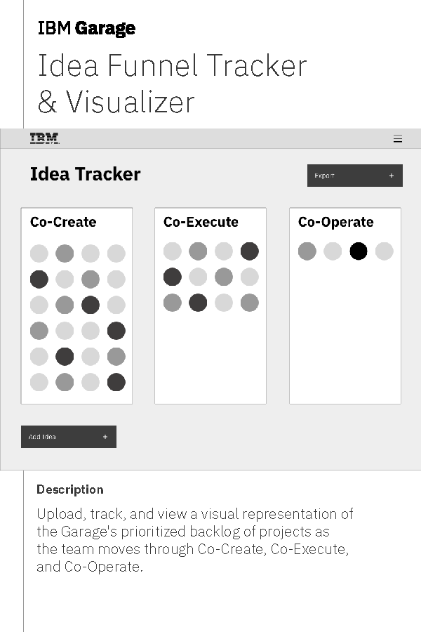
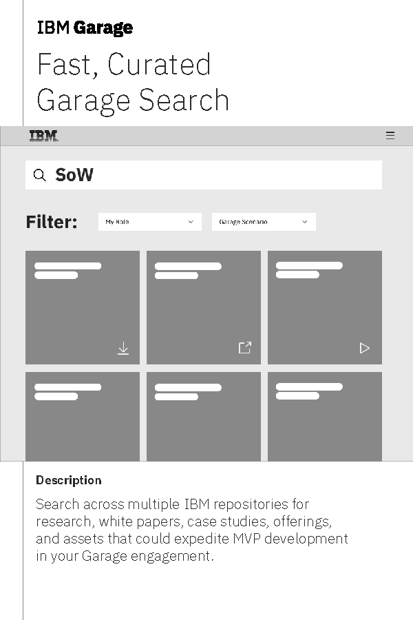
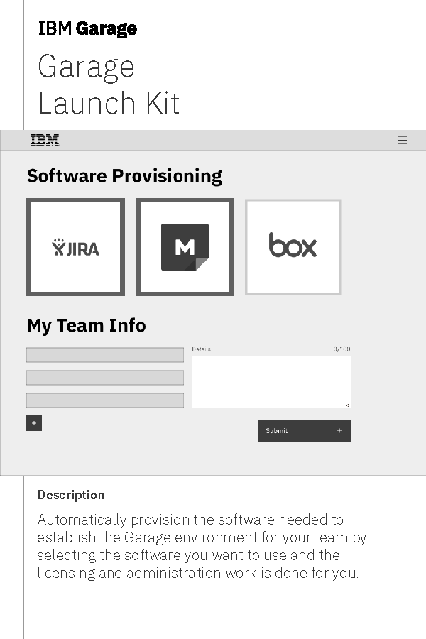
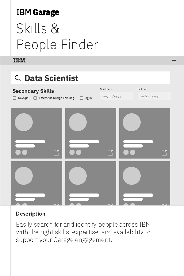
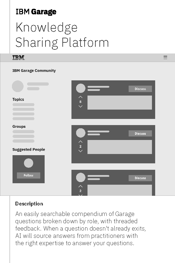
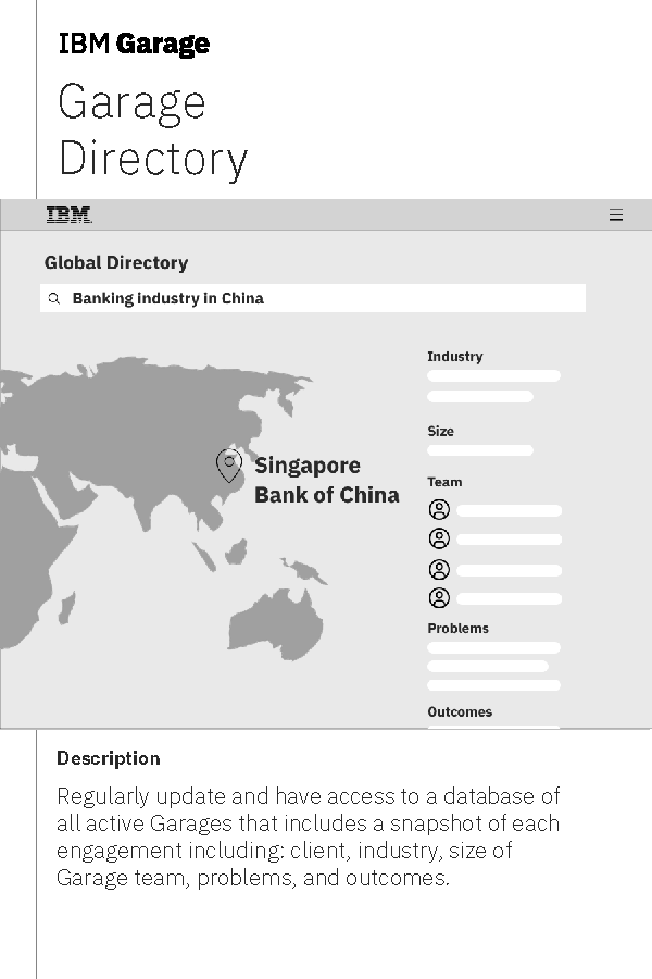
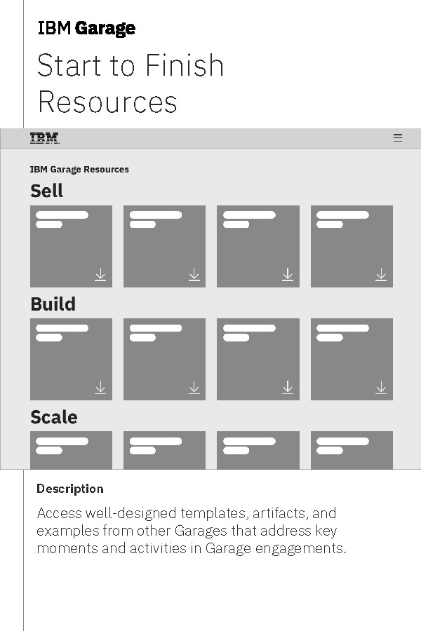
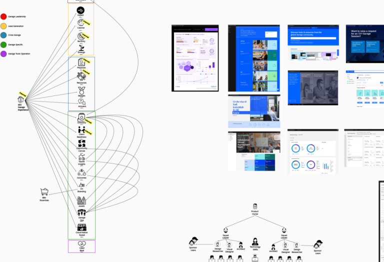
The perhaps unsurprising outcome was that senior leadership gravitated toward tools that provided holistic outcomes-based reporting and solutions that could speed up the process of selling, planning, and delivering Garages. Meanwhile, sellers and partners in the field needed a deeper understanding of the Garage methodology. Tools like the playbook, community, and badging—each offering different levels of training—helped them quickly get up to speed with all aspects of Garage.
The field teams are the conduit for both sales and delivering on the promise of a Garage. Our prioritization focused on addressing the needs of those personas first, with leadership needs being tackled as a fast follow.
Getting to work using Enterprise Design Thinking.
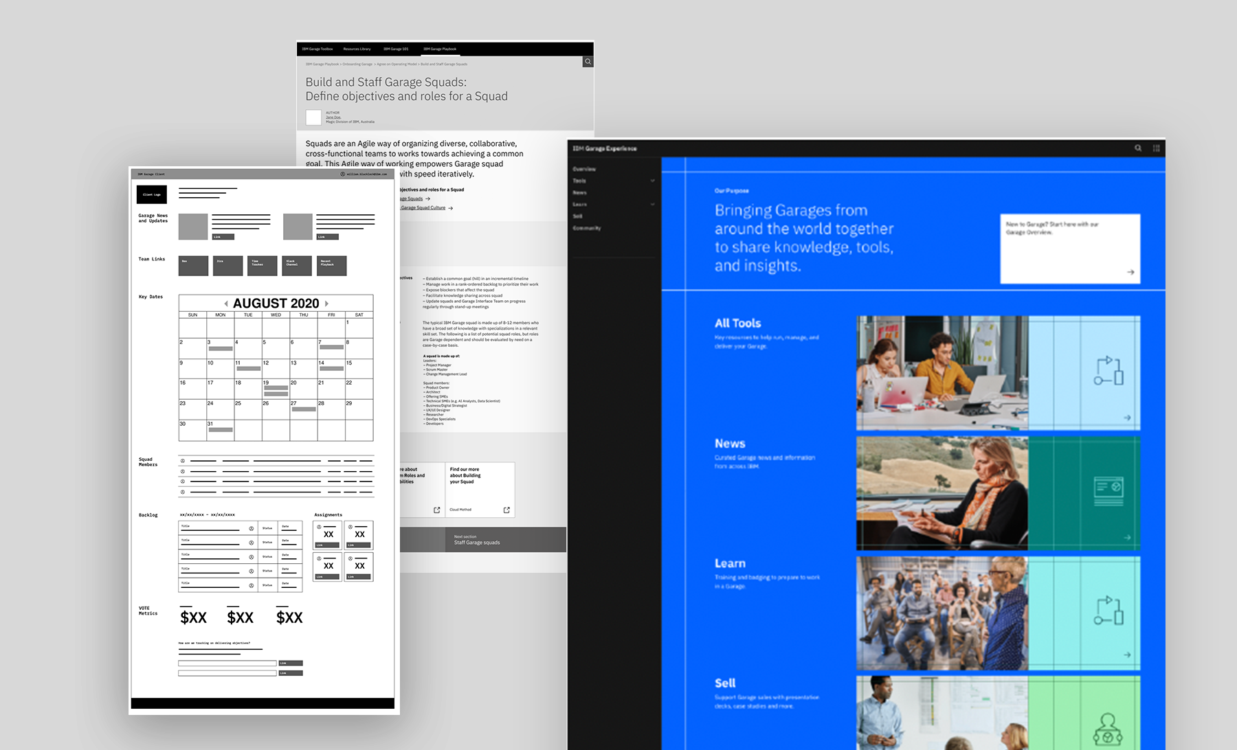
Each of the seven tools identified during the research needed a clear roadmap and set of requirements. I created timelines and grouped the specific stories and needs into Experience-based Roadmaps. This approach helped us develop minimal viable products (MVPs) to test key features and plan the next packages for subsequent releases.
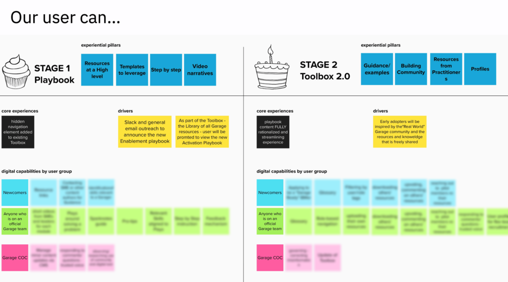
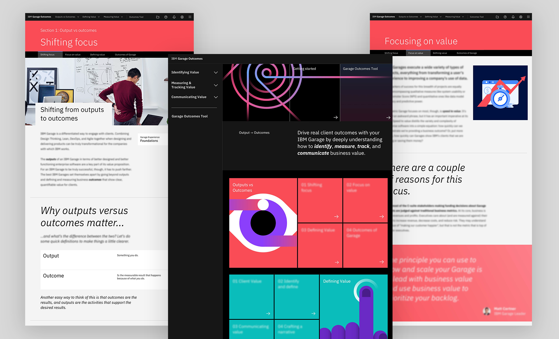
Aligning the content design and visual design experience came together through carefully crafted principles that we uncovered during our research sessions with users.

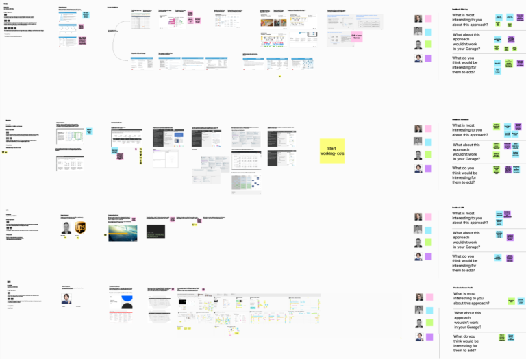
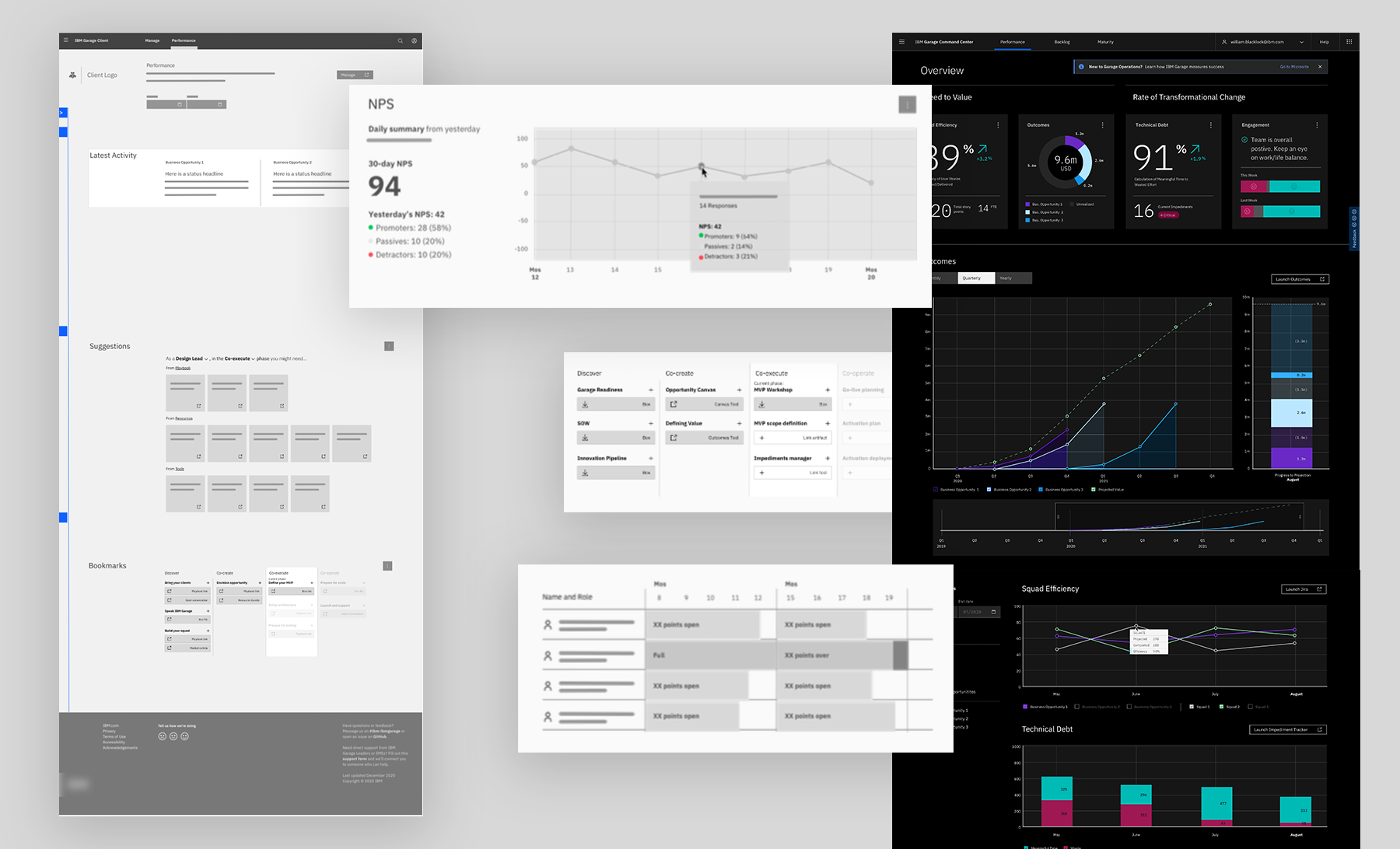
After each two-week iteration on the seven tools, we scheduled Playbacks with our stakeholders. These Playbacks (PBs) kept everyone aligned and allowed us to gather real-time feedback on the user stories and delightful yet impactful experiences we were creating. Playbacks began with foundational research and framing alignment, then progressed to sessions that got closer and closer to the final product direction, culminating in Playback 0. At that point, I created high-fidelity mockups, interactive walkthroughs, and production timelines, along with the necessary development-ready resources and direction for our development team.

The inner workings of user-first design implementation.
Every experience and tool creation followed the same or a similar approach leading to its eventual deployment.
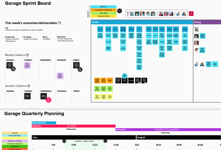
My responsibilities as a Design Lead
My toolset
My responsibilities as a Project Manager (Scrumban methodology)
My toolset
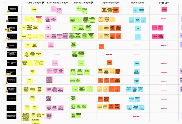
Framing, planning, and research artifacts
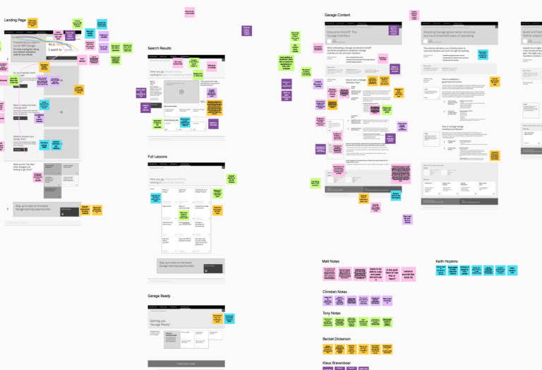
Designs low to high fidelity
Outcomes
Every deployment was completed on time and routinely iterated upon using direct feedback loops that I managed through a feedback system I created with GitHub, an in-house feedback onsite survey, and Slack APIs. All metrics reporting was gathered via Heap (Heap collects data from every part of our websites and collates it into data analysis), along with an NPS scoring tool I designed and developed after extensive research and collaboration with the client activation guild, of which I was a member, and the VOTE framework (Voices of The Employee) that IBM championed across all of IBM Consulting.
Once word spread through the internal marketing materials I crafted across various channels—such as Slack tables, targeted email campaigns, Garage community calls, and Q&As—the feedback was overwhelmingly positive and aligned with the needs we uncovered at the start of this project.
OF NOTE: During the first four months post the initial launch of the seven tool ecosystem, my team was reassigned to tackle a new design problem, so I was unable to report the metrics beyond those initial four months post-deployment.
NPS from Playbook, Experience, Resources, Squad Insights, & Outcomes surpasses industry averages on internal tooling
Total User count showing consistent and strong organic user growth
User sessions (user actions takes on a website) for the Playbook for time spent perusing content
Increasing the consistency and distribution of harvested artifacts from the Resources tool
User are coming back to learn more and access new released features and content
The overall Business impact in regards to saving time seeking answers
SUMMARY
This case study explores the internal adoption of IBM Garage, a unique approach to innovation and collaboration within IBM. By leveraging design thinking, agile methodologies, and a user-centered mindset, my design team under my project guidance and design leadership successfully created a team dynamic that fostered rapid experimentation and delivery of seven impactful solutions (plus other badging and artifact off shoots not mentioned in this study) for our user groups.
Key management & design processes I employed: